A Data Scientist’s Guide to Fetching COVID-19 Data in 2022
Sometimes the best way to get something done is to do it yourself.
During the early days of the pandemic, it was a popular exercise for data scientists and analysts to build COVID-tracking dashboards. A number of public APIs were spun up, but one by one these services are being taken offline. As of December 2021, the New York Times GitHub repository remains as one of the last high-quality COVID data sources, but even this source is not comprehensive and can be awkward to consume into your projects (it’s distributed through CSV files).
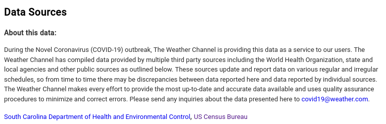
Despite aggregators ceasing to publish curated data, states’ health departments continue to diligently report counties’ COVID statistics. For example, The Weather Channel credits each state’s health department as its data source when displaying present COVID information.
Rather than relying on middlemen like the New York Times, you can pretty easily write your own scripts to fetch directly from the states. In this article, I’ll show you how to quickly ingest counties’ COVID data.
Motivation
A few weeks ago, a client approached me for advice on how to automatically track COVID-19 data for specific locations. For two years, he had been manually searching and entering data into a large spreadsheet, and this process took considerable time away from his actual job.
I promised I would look into our options, and very quickly I realized most of the popular APIs had already been shut down. I began with scraping from the New York Times, though several of the counties we needed were not present in the data set. I then considered scraping The Weather Channel, but then it dawned on me:
Why can’t I just fetch data directly from the states? After all, it’s what aggregators like NYT are doing anyway.
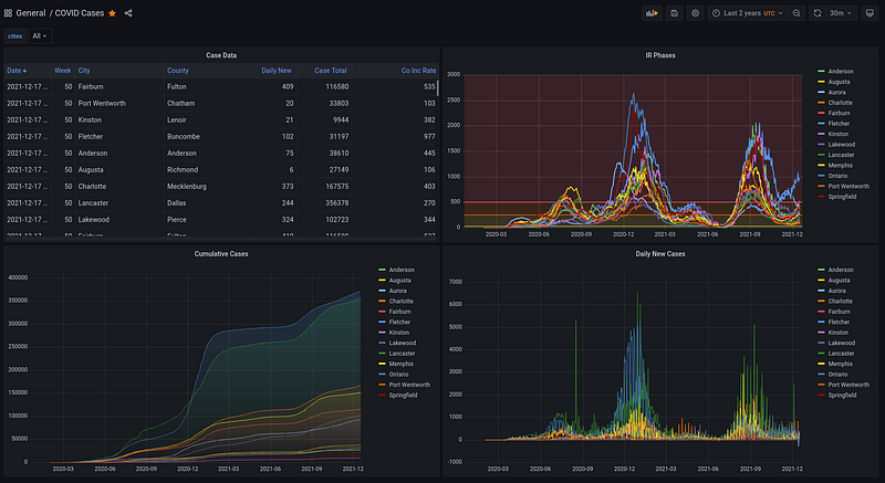
So after a few hours of research, I wrote some plugins and threw together a Grafana dashboard (pictured above) to visualize my findings. My client was definitely pleased, so I decided to write up my findings in this article.
Fetching the Data
To get data into Pandas, let’s use the built-in SQLite database sql:local to store our data. You can always use your own database, e.g. if you want to build your own Grafana dashboards.
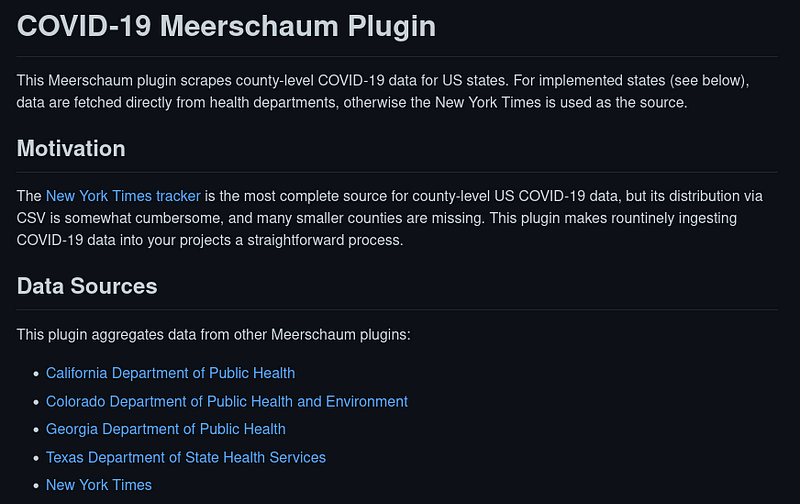
I’ve published my extractor scripts as the covid Meerschaum plugin ― a Python module format for extracting data.
I provide usage information on the plugin’s GitHub repository, and below I go into more depth about how I decided to fetch the data. To get started, first install Meerschaum from PyPI and install the covid plugin.$ pip install -U --user meerschaum
$ mrsm install plugin covid
Register a pipe with the connector plugin:covid and on the instance sql:local, and when prompted, enter a list of FIPS codes corresponding to your counties.$ mrsm register pipe -c plugin:covid -m cases -i sql:local❓ Please enter a list of FIPS codes separated by commas: 08031,48113,45043,45045,45007,37107,37021,47157,47147
Now that we’ve set up our pipes, let’s get that data flowing. Run the sync pipes command to fetch data ― the first time may take a minute or so.mrsm sync pipes -i sql:local
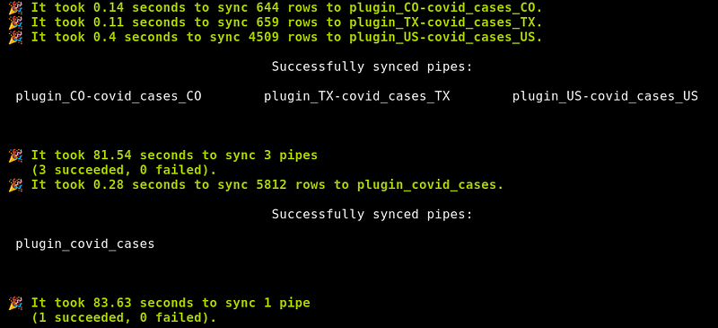
That’s it! You can sync continuously with --loop and --min-seconds, and the -d or --daemon flag runs the command as a background job.mrsm sync pipes -i sql:local --loop --min-seconds 3600 -d
Tap into the Pipe
Here’s a snippet to demonstrate ways you can access your pipe’s data:
How It Works
This is the part of the article where I pull back the curtain and give out my secrets. The covid plugin itself only executes other plugins and combines their results; for example, the US-covid plugin fetches from the New York Times:
Fetching data from specific states varies in difficulty ― for example, California provides a CSV, so parsing is similar to the NYT:
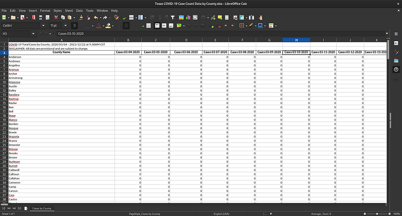
But other states are not so straightforward. The TX-covid plugin downloads and parses an XLSX spreadsheet that contains comments and adds a new column for each day. Parsing this esoteric format was a huge headache, which demonstrates the reason why Meerschaum’s plugin system is so powerful.
Like California, Georgia distributes data in CSVs, but you first need to extract a ZIP file to get the data sets you’re looking for. Here’s my solution from the GA-covid plugin:
Finally, Colorado exposes a RESTful API, which feels much less jank than the other states (although the API does not seem to be entirely functional, so it is not without its share of jankiness). Below is an excerpt from the CO-covid plugin:
Conclusion
Meerschaum is already very modular, and the covid plugin works in a similar way. If you would like to contribute, you can write and publish a plugin for your state and open a PR in the covid plugin repository.
You may have noticed my use of duckdb when writing plugins. I mostly think in terms of SQL, and DuckDB beautifully bridges the gap between SQL and Pandas. To use third-party libraries in Meerschaum plugins, add the dependencies to a global required list (similar to requirements.txt), and requirements which begin with plugin: are treated as Meerschaum plugins.
I hope this article has given some insight into how to fetch COVID-19 data. There’s no telling how much longer states will maintain their COVID reporting, but going into 2022, these plugins can help power your projects, just like they did for my client.